Main Essentials Window
The Main Essentials Window is where results are shown, along with controls for processing, filtering, visualising and exporting the data.
Most actions can be accomplished using the Create, Filter, Color etc buttons across the top of the data table, or by right-clicking on a group or sample. The other main part of the main window is the Imaging Tab, where images can be viewed etc.
Most buttons with a down arrow in their lower right corner show options when clicked on. The Process button is slightly different in that clicking on it will re-process the data. Clicking the down arrow to the right of the Process button will show options for processing (i.e. calculating results).
Plots Panel
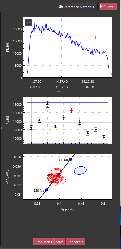
The Plots Panel of the Main Essentials Window is opened by clicking the Plots button (top right of main window) or by double clicking on a result. An example of the Plots Panel is shown in Fig. 8.

Fig. 8 A screenshot of the Plots Panel
The Plots Panel shows three plots by default:
A “Time series” plot showing the currently highlighted selection in the main data table. This may be empty if no selection is highlighted.
A “Stats” plot showing the mean and two standard errors of each sample within the group containing the currently highlighted selection. This plot may also be empty if no selection is highlighted.
A “Concordia” plot, which is a Wetherill plot for U-Pb analyses.
Each of these plots can be shown/hidden using the buttons at the bottom of the panel (by default all three will be toggled “on” and have a red background). Each plot’s size can be adjusted using the dotted line control at the bottom of each plot.
Time Series Plot
The “Time Series” plot shows the data for the channel of the currently highlighted channel in time series. The selection is shown as a dashed red rectangle, the vertical center of which reflects the mean of the data within the selection (± any outlier rejection). The upper and lower edges of this rectangle show the mean plus or minus the 2 SE of the data within the selection for the upper and lower edge, respectively. The left and right edges of the rectangle represent the start and end times of the selection, respectively.
Because the vertical position of the rectangle is determined by the underlying data, the position of the rectangle cannot be adjust manually. However, the interval can adjusted. In this plot, the mouse icon changes to a hand symbol when over the selection interval, or a double-ended arrow near the edges of the selection. These icons reflect what happens when the user clicks and drags in this plot. If the hand icon is visible, clicking and dragging will move the selection left or right in time without adjusting the duration. When the double ended arrow icon is visible, clicking and dragging will adjust the start or end times of the selection depending on which end is clicked. The rectangle representing the selection updates in real-time.
Scrolling the mouse wheel while hovering over this plot zooms both vertical and horizontal axes. Clicking and dragging outside the selection interval moves the plot extent around in both the vertical and horizontal axes. Toggling the ‘10ⁿ’ button will toggle between a linear or logarithmic vertical axis.
To reset the plot, click on a different result in the main table and click back on the original result.
Stats Plot
The “Stats” plot shows the mean and uncertainty (as two standard deviations) of each result in the group containing the currently selected result. The currently selected result is highlighted in red; other values in the group are colored black. A solid line is drawn across the plot showing the group mean. A blue rectangle shows the group uncertainty: the upper and lower edges are the mean ± 2SD for the group.
Double-clicking a result in this plot will highlight it in the main data table (and update the Time Series plot). Scrolling the mouse wheel over this plot zooms in/out. To reset the zoom of this plot, click on another result.
Concordia Plot
The “Concordia” plot shows a Wetherill concordia plot of results in the group, with the currently highlighted selection plotted as a blue ellipse; all other selections are plotted as red ellipses. The style of the plot can be changed between Tera-Wasserburg and Concordia by right-clicking on the plot and selecting the appropriate choice from the “Style” options.
Scrolling the mouse wheel while hovering over this plot zooms both vertical and horizontal axes. Clicking and dragging outside the selection interval moves the plot extent around in both the vertical and horizontal axes.
Adjusting the selection in the “Time Series” plot will update the Concordia Plot in real-time. The Concordia Plot extents can be fixed using the “Resize” options in the right-click menu. The “Selection” options adjusts the axes extents to keep the currently highlighted selection centered. The “Group” option keeps the extents constant after clicking this option, regardless of changes to the currently highlighted selection. None will apply no adjustments to the extents.
The uncertainty represented by the ellipses can be changed via the “Error” options in the right-click menu.
Markers showing ages along the concordia line can be adjusted using the “Markers” options in the right-click menu.
Imaging Tab
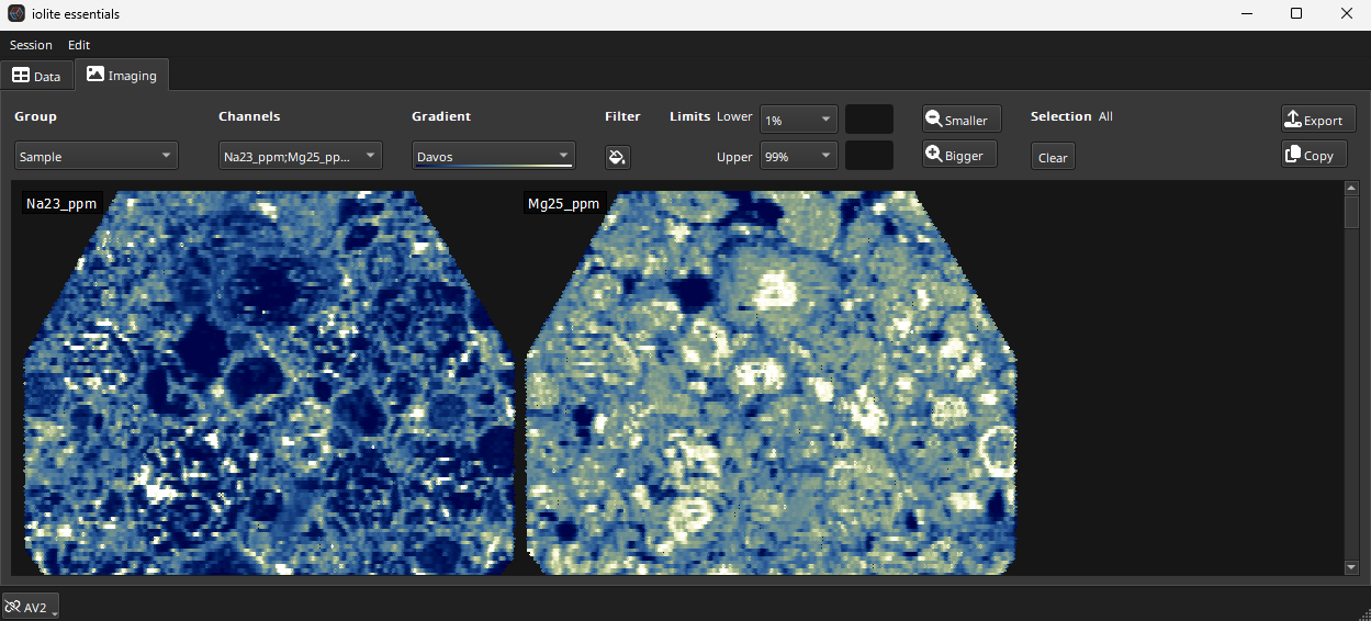
In the top left of the main window there are two tabs: Data and Imaging. Clicking on the Imaging Tab will open the Image Tab and images user interface. Note that the Imaging Module is a separate subscription module. A screenshot of the imaging tab is shown in Fig. 9.

Fig. 9 A screenshot of the Imaging Tab in iolite Essentials
The controls for the Imaging Tab are arranged at the top of the window and tend to be used left to right. When creating images in a new experiment, the first piece of information that iolite requires is which selection group to create images for. You can have multiple groups within an experiment, each representing a different sample etc. Use the drop-down menu to select the group.
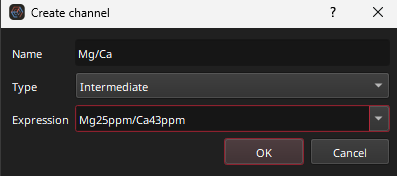
The channels to create images from are selected using the Channels drop-down menu. Images can be created from any Input, Intermediate and Output channel. At the bottom of each sub-menu (Input, Intermediate or Output) there is a “Toggle all” button at the bottom of the list. Use this to select all channels in the sub menu. For example, to create images for all Output channels, click the Toggle All button at the bottom of the Output sub-menu.
Once a group and channels have been selected, Essentials will create image thumbnails and show them in the main part of the window. By default, all images are selected. Clicking on an individual image thumbnail will select that image. Selected images will have a thin red border and be listed next to the Selection label (to the right of the Smaller button). To return to all images selected, click the “Clear” button beneath Selections label. To apply settings to an image (such as setting the color gradient, described below) click on that image, or click the Clear button to apply settings to all images.
The color gradient can be selected using the Gradient drop-down menu. Limits for the color gradient can be set using the Limits controls: the Lower and Upper fields. These fields can be automatically set to specified percentiles (e.g. 0.1%, 1%, 5%, 10% for the Lower limit) or to 2SD of the mean/median. Or a custom value can be used by typing the value into the limit field. Limits are explained in more detail here.
The Filter button (with a paint can icon) applies a gap filling filter. This can be used to fill very small gaps in your image, typically used when the scan speed for an image experiment was too fast, leaving gaps between measurements. To remove this filter, click the button again.
The Smaller and Bigger buttons will decrease/increase the size of the image thumbnails shown (this does not affect the underlying data resolution, just the preview image size).
Double-clicking on any image will show the individual image in more detail. When an image is shown in detail, clicking the < or > buttons (top left) moves between images. Selecting an image from the drop-down menu in the top left also changes the image shown. The palette button toggles whether the color scale is shown to the left of the image.
Clicking the button will return the display to all images.
Clicking the Copy button will copy all images to the clipboard.
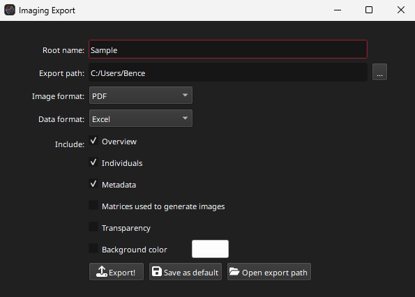
Clicking the Export button will shown the image export options dialog (shown in Fig. 10).

Fig. 10 A screenshot of the export images dialog
The Root Name is added to the start of each export image (e.g. “[Root name]_Na23_ppm”). The Export path is the path to the folder where the images should be saved. The folder can be set by clicking the … button at the end of the Export path field.
The exported image format can be set to PDF, TIFF, JPF or PNG. The Data format options relate to the format of the matrices created if the user selects the “Matrices used to generate images” option. Selecting this option will create a file in the Data format (Excel, CSV, or tab-separated values “TSV”). Note that selecting this option may result in a long export time as the data for each image are converted to the selected Data format.
The Overview option creates an image that contains all the image thumbnails. The Individuals option exports each image as its own image file. The Metadata option creates a file in the Data format with the image metadata (height, width etc). The Transparency option ensures blank parts of the image remain transparent in the exported images. This only works with Image formats that support transparency (e.g. PDF and PNG). The Background color option sets the background color of the exported images.
The Export! button will export the images according to the selected options in the dialog in the Export path folder. The Save as default button will save the selected options as default for each time you export images. The Open export path button will open the folder selected in the Export path option in your systems default file explorer.


 .
.